PAST PROJECT
A completed job that we're still proud of
What is the most famous compilation of superlatives on Earth? The Guinness Book of World Records.
Every year, thousands of people around the world attempt absurd, or unique, or even dangerous feats in an effort to gain renown as the fastest, the most gluttonous, the most remarkable in an ever-broadening field of human achievement, all under the watchful eyes of the discerning Guinness judges.
Of course, there are plenty of record-holders in completely unrelated categories, such as the tallest building, the deepest fresh-water lake, the smallest bird, and on and on. But whenever an existing record is broken – as happens with great regularity in the sports arena, for one example – the world takes a moment to marvel at the sheer audacity of striving to be declared Number One.
The Talented Administer Ripley
No wonder, then, that the visionary folks at Ripley Entertainment – best known for Ripley’s Believe It or Not, which first appeared as a series of newspaper cartoons before expanding to a television show and a chain of popular Odditorium museums – wanted to base their next walk-through attraction on some of the Guinness Book’s
more fascinating extremes.
As a designer/art director working on contract to The Nassal Company, I was thrilled to take part in the conceptualization of a good number of the interactive exhibits, and did my best to make them fun as well as informative. I recall with great fondness a technology-oriented section that we patterned after an oversize electronics mother board, where guests navigated between refrigerator-sized transistors and other components as they experienced the various achievements that transformed our daily lives.
Tapped for a Paint of Guinness
While I was working on this, I was approached more directly with the prospect of an outside commission directly from the Ripley people. They wanted a surrealistic painting to depict a lot of world records in a dramatic fashion, which they would use in their advertising and other endeavors. To show the kind of thing they were looking for, they gave me a color illustration that I immediately recognized as the cover of Ray Bradbury’s book The Illustrated Man, which featured a man whose tattoos represented the various stories as the inked images came to life.
I could not in good conscience borrow that particular concept for this piece, but I told them I would figure something out. I played around a bit, trying to find a way to work all sorts of records from nature as well as human achievement into a single eye-catching image.
RECENT PROJECT
Germ of
an Idea
Posters Help
Spread the Word
about the Spread
of a Deadly Virus
An example of what we've been working on lately
It was like the final scene from The War of the Worlds, only a lot less hopeful. A creature of microscopic size took down powerful commercial behemoths like Disney World and Universal Studios, who stumbled, awestruck, as their tourist clientele were forced to social-distance themselves from even long-planned family vacations.
Among the many consequences of this theme-parkalypse was the cancellation of proposed design-and-build projects upon which independent contractors and freelance designers depend for our livelihoods.
Many of those who were laid off, or saw their business prospects suddenly dwindle, took advantage of their drastically increased free time to re-engage with their families, catch up on chores at home, pack on pounds by eating snacks in front of the TV, and of course, broadening their search for new opportunities.
I was no exception. In the field of art and design, it is important to showcase, on occasion, some new work, in hopes of catching some potential client’s eye. Perusing the Internet for new leads, I came across a competition run by Talenthouse
Magazine for graphic arts that inform the public regarding the battle against COVID-19. It was sponsored by the United Nations.
Though there was no prize to be had, it seemed like a fairly good way to reach out to untapped markets, and possibly to actually do some good. So, like a nurse with a patient who whines about having to swallow a pill, I decided to give it a shot.
My primary inspiration was the many public service posters printed up during World War II, some to discourage helping the enemy (“Loose Lips Sink Ships” for an example), and others to encourage pulling together (“Buy War Bonds” and reminders to save aluminum for the building of fighter planes).
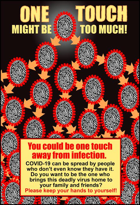
First up was a graphic representation of one virus multiplying exponentially to show how a single touch by an infected person can quickly grow into a multitude. Here I devised a simplified representation of a coronavirus whose interior was a human fingerprint, signifying the devastating effect of a mere touch.
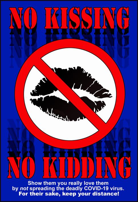
The second poster was directed at people who, because of their warm personalities, family traditions or youthful disregard for consequences, were inclined to spread the virus through practices that in normal times would be welcome, if not expected -- in effect, a different take on the “loose lips” idea.
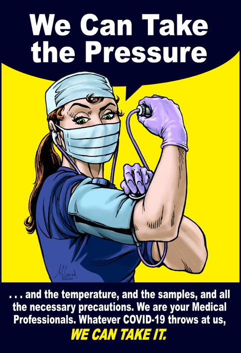
The next one was a more direct homage to the iconic “We Can Do It” poster that encouraged women to step into traditionally male manufacturing jobs while the men went off to fight the Axis powers.
Brush with Destiny
Guinness Books World Record Artist
Red-nosed Rein-gator: Animal characters got a whimsical makeover to get into the holiday spirit.
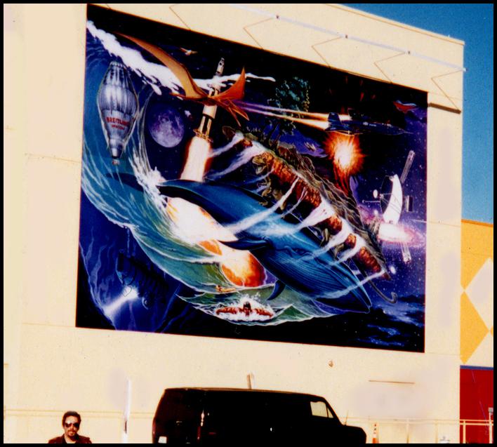
Seeing the Big Picture: Enlarged to more than 13 times its original size, the Guinness mural was mounted on the exterior wall facing the Mercado's parking lot. The artist is standing about thirty feet from the wall for scale.
They say hindsight is 20/20.
And don't we all wish we could just look at 2020 in hindsight? The coronavirus pandemic has taken a toll on the economy, and the Themed Attraction industry has taken its share of punches, with major parks shutting down, laying off workers and calling a halt to any new development that is not a response to the need for greater social distancing.
We have been fortunate to keep working at least some of the time, but we are eager to see affected companies back in business. In the meantime, we are staying positive, trying new things, and working on ideas that we have not had the time to develop until now. Here's hoping you are doing the same. We will get through this!
In my version, the woman is a nurse or doctor, wearing a mask, hair covering and latex gloves while defiantly checking her own blood pressure. The caption is a wry “We Can Take the Pressure,” and goes on to list other things medical professionals are geared up to do in an effort to keep the rest of us healthy. An alternate version was also made that did not mention COVID-19 specifically, for use after the pandemic had run its course.
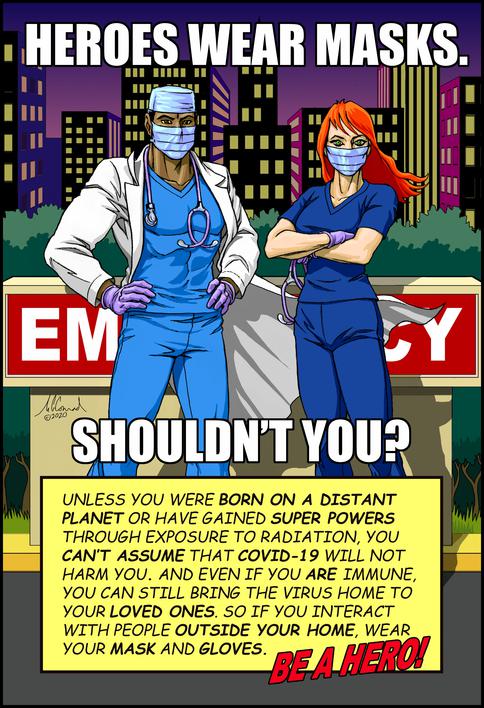
The final poster was designed to work on two levels. Drawn in the style of a modern comic book, it depicts a male and female medico in white lab coats, posing dramatically in the driveway of an emergency room entrance, their hands and faces covered with the appropriate protective accessories. The caption reads, “Heroes Wear Masks; Shouldn’t You?” Thus, it strikes a note of admiration for those fighting the pandemic on the front lines while encouraging others to emulate their behavior.
I printed out a few of these and mailed them to my niece and my sister-in-law, who are nurses. They both liked them enough to hang them up at work where, I hope, they might get the point across to their patients, or at least give their colleagues’ morale a much needed shot in the arm.
LOST PROJECT
Our part was finished, then -- what?
The Pursuit of
© Ripley Entertainment
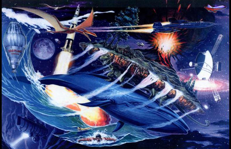
Then suddenly I remembered an old image from Hindu mythology, which described the Earth as a disk of land borne on the backs of four giant elephants, which in turn were riding through the Universe on the back of an enormous turtle.
Lots in Space
In my rough sketch, I used the disk of Earth to show such things as the biggest volcanic explosion in history (Krakatoa), the highest waterfall (Venezuela's Angel Falls), the largest human construction (the Great Wall of China), and other land-based extremes.
This disk is carried aloft by the largest known dinosaurs of the herbivorous and carnivorous varieties, which in turn are riding the back of the hugest animal ever to live on our planet, the blue whale.
The rest of the painting is populated by a variety of other world records, such as the biggest rocket (the Saturn V), the deepest oceanic descent by humans (the bathyscaphe Trieste exploring the Marianas Trench), the fastest animal (a peregrine falcon in full dive), the largest flying animal (Quetzelcoatlus northropi, an extinct pterosaur), the fastest jet plane (the SR-71, officially rated for Mach 3.2, but rumored to exceed Mach 5), and the farthest roaming spacecraft (Voyager 1). Although it doesn’t actually appear in the Guinness Book, I could not help throwing in the world’s fastest glider, the Space Shuttle, which comes screaming into the atmosphere at a blistering Mach 25.
The client loved the concept, but complained that there were no people in the painting. I pointed out that there is a guy in the life raft (who held the record for surviving thus for almost half a year), but they insisted on something more. So I added a shot of Mark Spitz, breast-stroking his way to a record seven gold medals at the 1972 Olympics.
Fallin’ Angle
Now, in order to make all these amazing things fit on a board only 2 feet by 3, I tilted the whole earth assemblage at an angle. Stepping back, though, I could see that it looked like the whale was diving, and taking us all down with it.
But then I had an inspiration. Grabbing my protractor, I measured the angle of the dive, which turned out to be about 23.5 degrees from the vertical. As luck would have it, this is the same angle the earth’s axis is tilted from the plane of the ecliptic (whereupon it rotates – the difference being what gives us the seasons). So, yeah, I must have planned it!
I took pains to paint the details of this image as tight as possible because I knew it was going to be enlarged quite a bit. In fact, it was blown up to about 40 feet wide and plastered on the outside of the attraction’s building, facing the parking lot. The completed image was divided into 22 printed panels. This worked fine until the very last one, which somehow got hung at a crazy angle (I don’t think it was 23.5 degrees, though).
To compensate until a new set of panels could be printed, they spanned the gap with a triangular section that had the unfortunate effect of splitting my signature in two. I had long ago gotten into the habit of signing my work somewhere deep into an image so that it would not be cropped out, as had happened a few times, but never had I anticipated this.
However, it was not long before the picture was corrected, and there it remained for two years (2000 to 2002), until the Orlando attraction was forced to close when tourism dropped off sharply in the wake of the 9-11 attacks and the recession.
Last I heard, the original acrylic painting was still hanging on the wall at the Ripley’s offices in Orlando. I wish I could claim some kind of world record for this painting (Most world records depicted in a single acrylic painting? Most overpaid artist? Most serendipitous explanation for a design flaw?), but alas, I have yet to make it into the records book. The commission, however, did make it into my tax records, so I guess that’s something.
Creating the Happiest
Place in Vietnam
Happyland
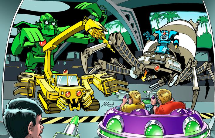
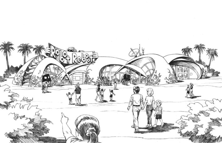
Nuts 'n' Bolts in Revolt. An interactive dark ride in the Cosmic Crusade section of Happyland, Robot Reboot gives guests the means to reprogram rebellious machines before they destroy everything in their path.
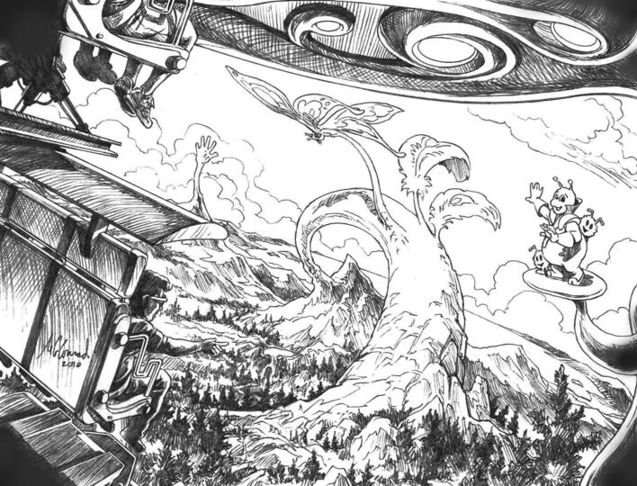
Changing the World. In the Starship Odyssey simulator, guests fly over the earth as the alien host demonstrates his advanced technology, morphing the terrain into whatever shape is desired.
© Steelman Partners
© Steelman Partners
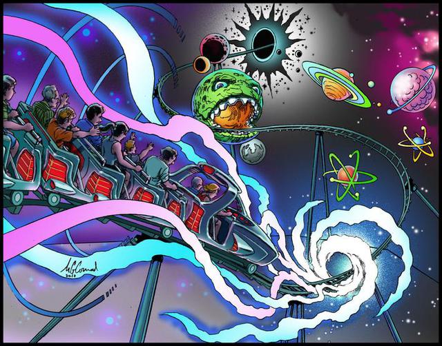
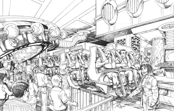
Long, Strange Trip. The effects-laden roller coaster Space Warp takes guests on a mind-bending journey through alternate dimensions where physical laws may differ from our own.
© Steelman Partners
Steelman Partners is an international company known for designing world-class luxury resorts, hotels and casinos. (Click here to see their amazing portfolio).
But when they decided to branch out in the direction of theme parks, they soon realized they were going to need someone on board with that particular kind of experience. Enter Bill Cunningham, who had recently worked as Director of Creative Services for the imaginative Hard Rock Park in Myrtle Beach.
In the role of Senior Planner, Bill took the reins on KT Happyland, an expansive resort project near Ho Chi Min City, Vietnam. Part of the land was going to be a theme park on the scale of the Magic Kingdom, and be based on an original IP.
Looking at the preliminary drawings, he immediately noted that the buildings were all too big.
That's not at all surprising. Steelman’s brilliant cadre of architects were used to thinking in terms of mega-casinos and luxury hotels; even the most impressive dark ride needs only a fraction of that square footage, almost all of it on one or two floors. But this was an easy adjustment to make, and it freed up more space for other rides and attractions.
What Happened in Vegas
As one might expect, the firm employs an army of talented people across a broad spectrum of specialties, and they had done a phenomenal job getting this project started. But at some point it was decided to bring in a few more creatives to look at the concept with fresh eyes. Bill suggested a few names, and soon I was winging my way out to Vegas for a month-long charette with two other accomplished designers, Sywa Sung and Ross Jermano.
An enormous amount of work had already been done on the design of the park, including a master plan and written descriptions of the main attractions and their surroundings. Our job for the next four weeks was to flesh out the details and, if possible, breathe some life into those parts that might need it.
We divided the work among ourselves, relying on each other and the permanent Steelman staff whenever someone’s particular expertise was called for. It was a great comfort knowing that I could count on their sage advice regarding interior decoration, branding concerns, insights on the clients, and so on.
The vision for Happyland was a circular hub-and-spoke design with sectors based on distinct themes. Among these were Ancient Cities, SuperLand, Nature’s Fury, Cosmic Crusade, Bugsville and Pin & Ping’s Imagination Island. The last two were well on their way to completion, having been rendered in 3-D by Keith Winters and his team at Inviro, with a few exceptions, such as the bird-themed dark ride Flutter and Fly.
With his architectural background, Ross concentrated on the practical side of the buildings and their operational requirements while Sywa and I took on the stories and their supporting visuals. We spent a couple of days reviewing and revising the storylines for various attractions, building on the written concepts that had already been put in place. For my part, I brainstormed with the responsible teams, applying my sci-fi background to the futuristic world of Cosmic Crusade and bringing my extensive knowledge of comic books to bear on SuperLand.
Strange Visitors from Another Planet
The primary challenge in Cosmic Crusade was to come up with an environment that would appear futuristic and other-worldly without merely copying what had been done in other venues (i.e., to boldly go where no designer had gone before).
What I came up with was an alien technology that the visitors had brought with them, enabling them to “grow” stone and crystal into gracefully swooping structures with grand, organic shapes. The stories the aliens wanted to tell would give guests a taste of their advanced machinery and galaxy-spanning travels while sharing odd bits of their strange culture. In one 3-D theatrical show, the live host seems to reshape the terrain as a way of illustrating his fascinating tale.
Able to Leap Tall Buildings
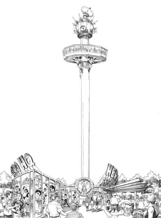
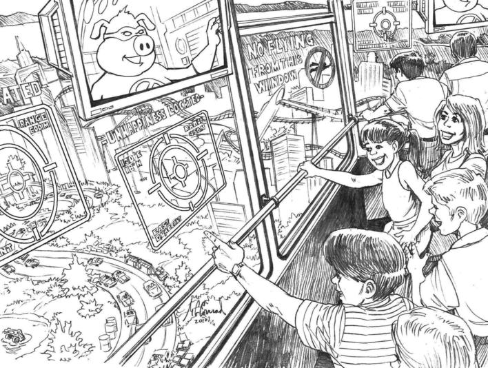
SuperLand was, of course, all about superheroes. There was a catapult-launched roller coaster named StratoChasers, in which guests flew amid skyscrapers to nullify an armada of laser-wielding drones, and a Hero HQ platform that would carry guests to the top of a high tower to watch for signs of trouble through high-tech windows
Didn’t Stay in Vegas
As the charette came to an end, the three of us went our separate ways again, but there was still plenty of work to do. I was kept busy for the rest of the year, working remotely for the most part, refining and expanding on the work we had already done.
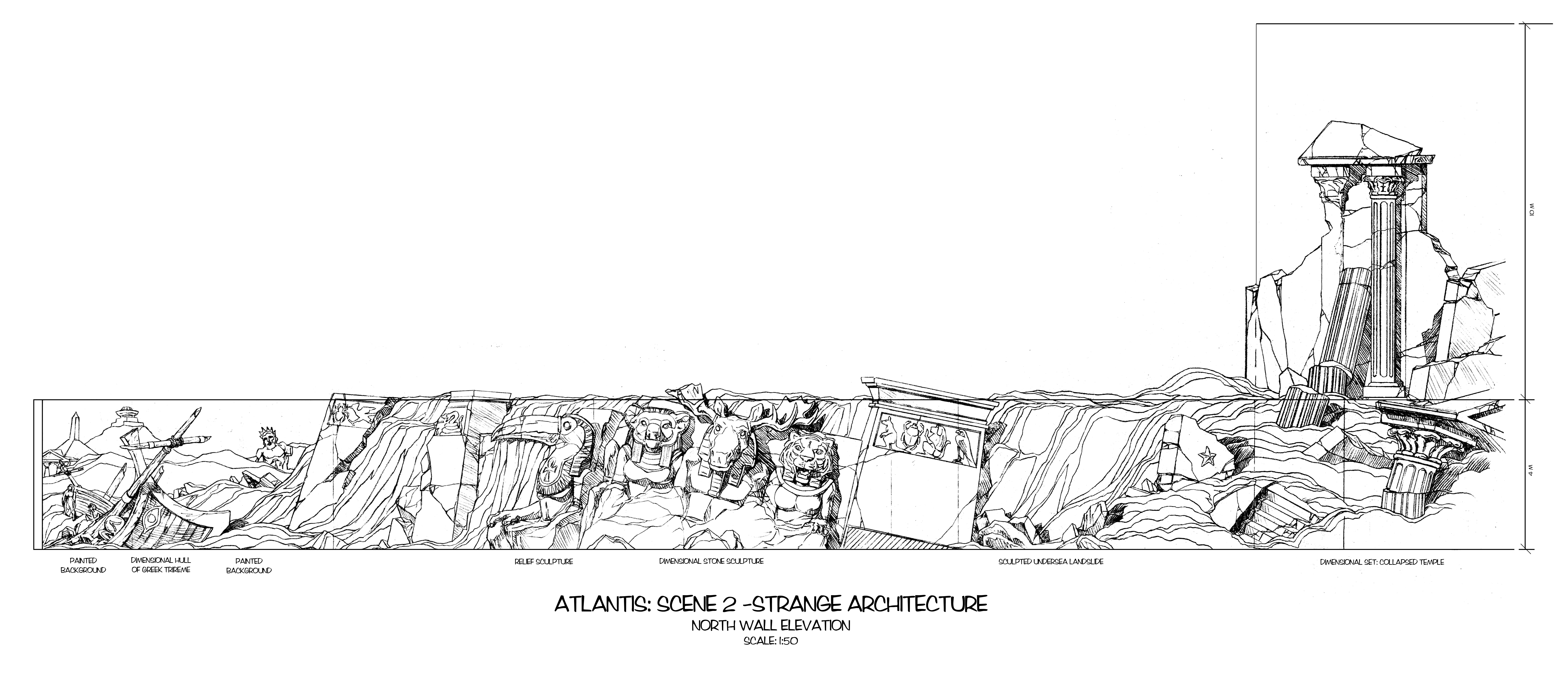
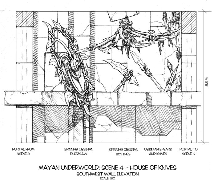
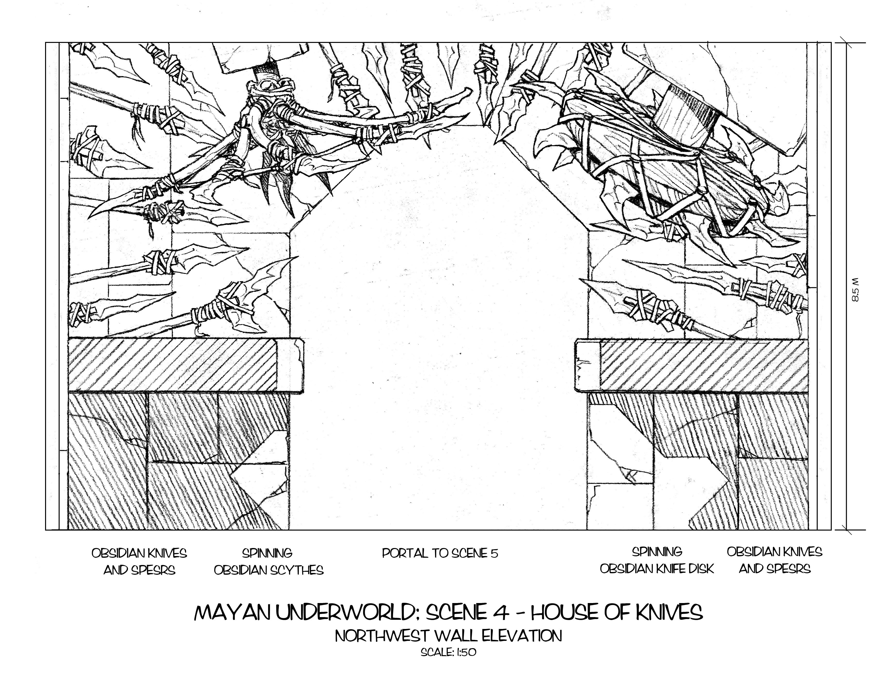
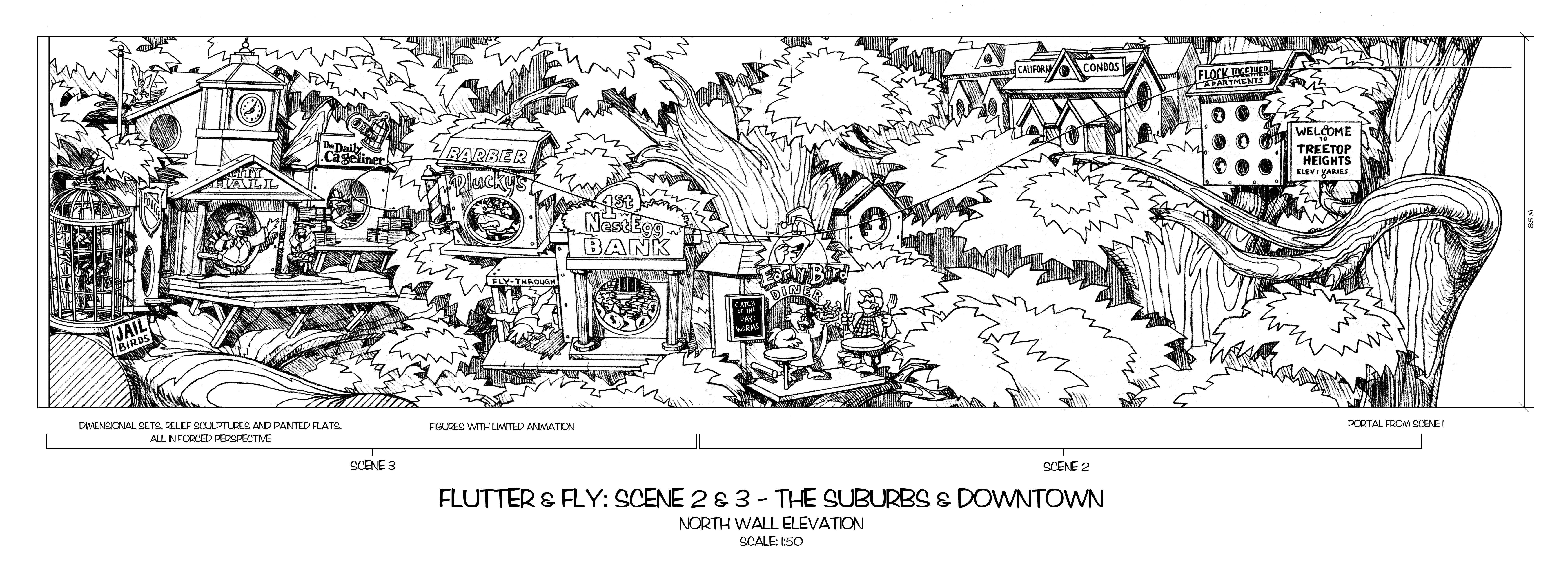
In addition to a ton of conceptual illustrations and color storyboards, I was tasked with drawing up schematics of every scene in a good number of the dark rides. For each of these, I produced scaled elevations of what was visible on both sides of the ride path, plus whatever archway or portal the vehicle would pass through next.
World Under the Sea
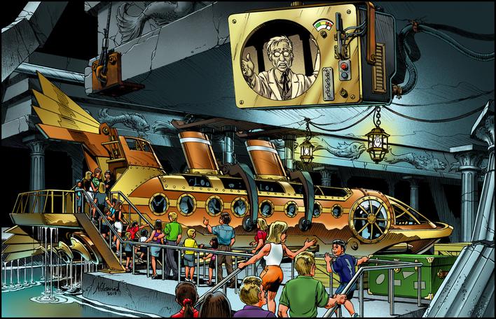
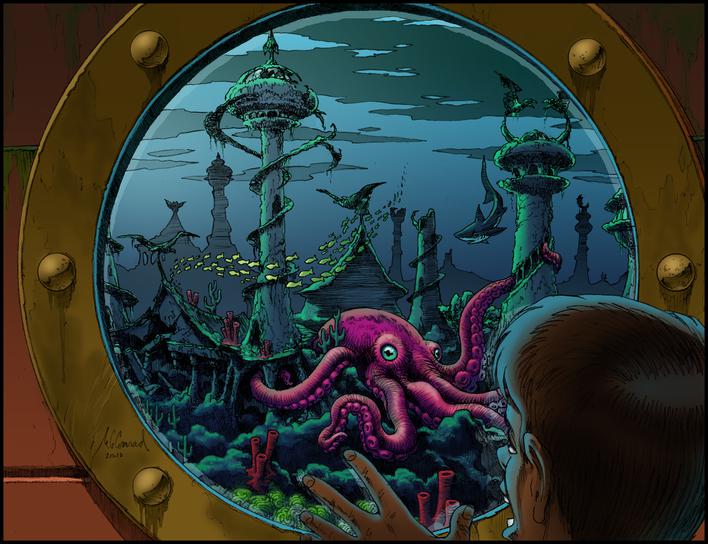
In Atlantis, a steampunk submarine (which I really enjoyed designing during the charette, helping to illustrate Sywa's imaginative storyline) wends its way through the various undersea environments within the fabled Bermuda Triangle. Powered by a locomotive engine, the sub explores a graveyard of sunken ships from many eras, a pharaonic ruin whose giant statues of gods are topped with the heads of animals from continents unknown to the ancient Egyptians, and a courtyard where an enormous gemstone pulses with powerful energy to light the esoteric cityscape beyond.
See the Underworld
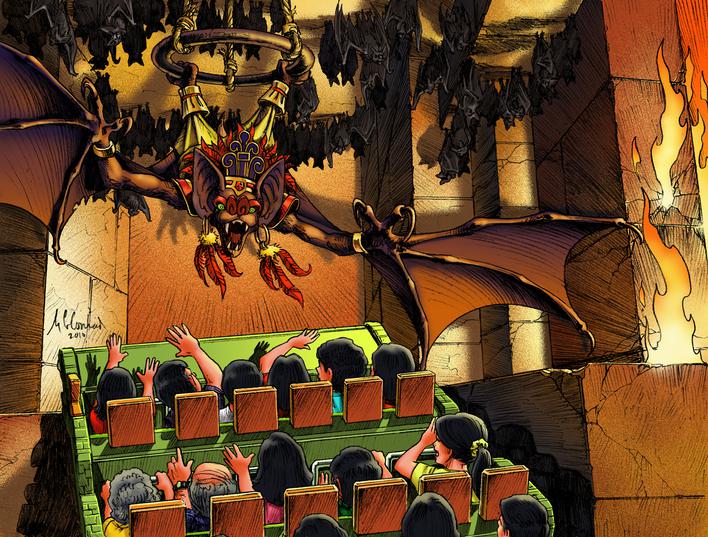
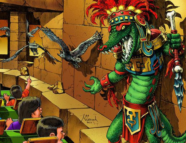
In Mayan Underworld, guests are led by owls into the eerie world of the Mesoamerican afterlife in Xibalba, where they must pass through several harrowing chambers. Among these are the House of Fire, the House of Cold, the House of Bats, and the House of Knives. In this last one, I envisioned spinning disks and swinging pendulums with scalpel-sharp obsidian blades that swung aside just before blood was spilled.
Wander the Woods Scenes
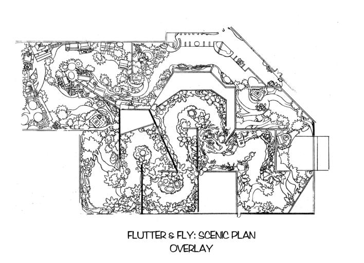
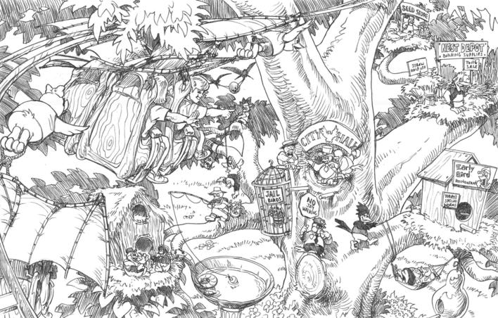
In Flutter and Fly, a young bird sets off on an adventure through unfamiliar woods, where he has a run-in with a predatory hawk before finally returning to the whimsical city of bird houses that is his home. Guests are towed along on their own aerial track, swooping and diving between the trunks and branches of trees as if they were the size of a sparrow.
No Happy Ending
This is just a sampling of the vast amount of work that went into the design of Happyland, a massive undertaking by a truly inspired team of creatives of which I was honored to be a part.
Unfortunately, the project was beset by legal troubles and suffered the withdrawal of major investors, which forced the clients to scale back. It has since opened, but little remains of the imaginative theming we worked so hard to create. But who knows? Maybe someday they'll make enough money to bring it all back to life.
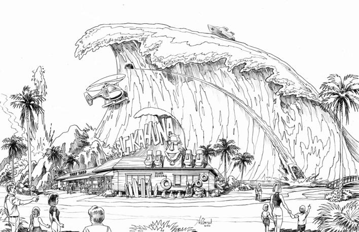
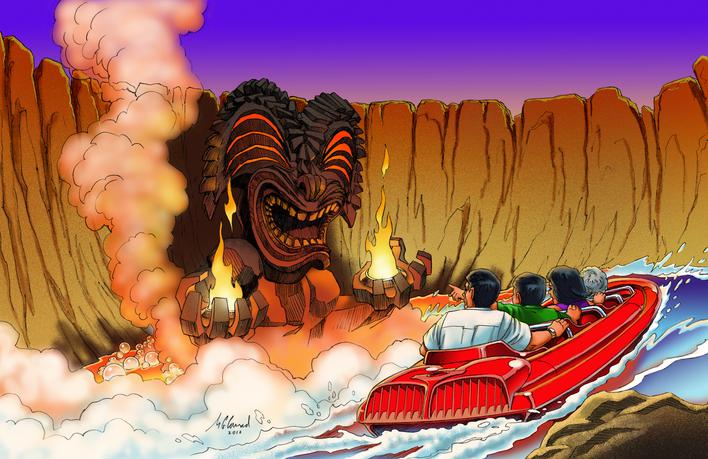
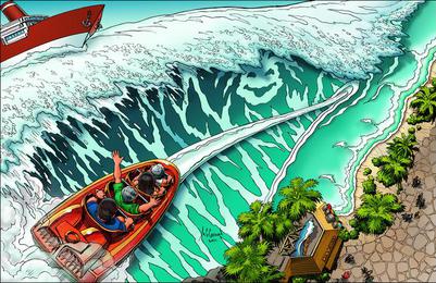
Catch the Perfect Wave. It's time to ride the once-in-a-lifetime super-wave the surfers call The Big Kahuna. Guests are towed in kayaks up through the lava tubes of a smoldering volcano to reach the necessary height for a heart-stopping plummet down the curl.
© Steelman Partners
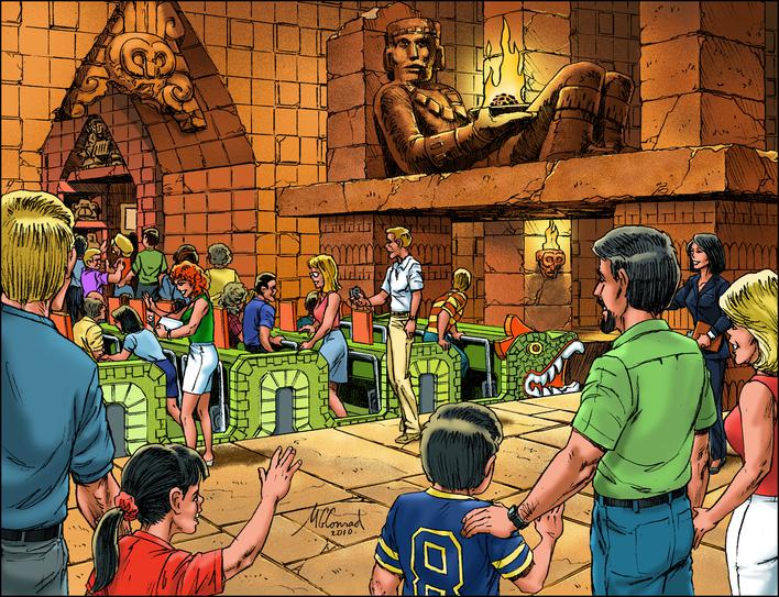
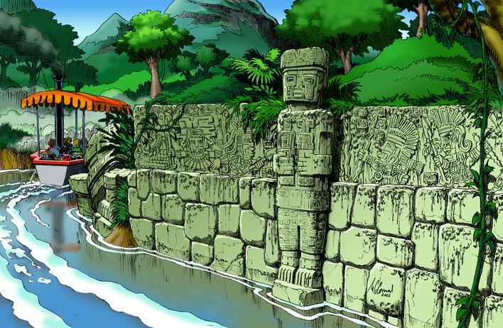
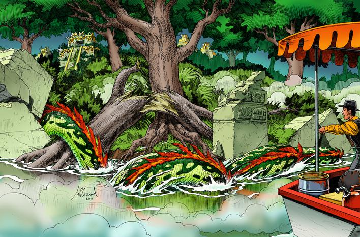
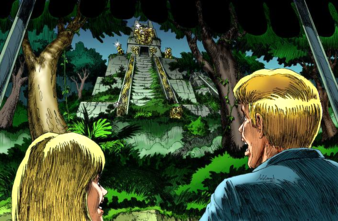
Where Dreams End Up in Ruins. Guests join an expedition up a lost tributary of The Golden River in search of an ancient city covered in precious metals. Snaking their way through a maze of Incan, Mayan and Aztec ruins, they finally catch sight of their goal, only to be turned away by the giant feathered serpent.
© Steelman Partners
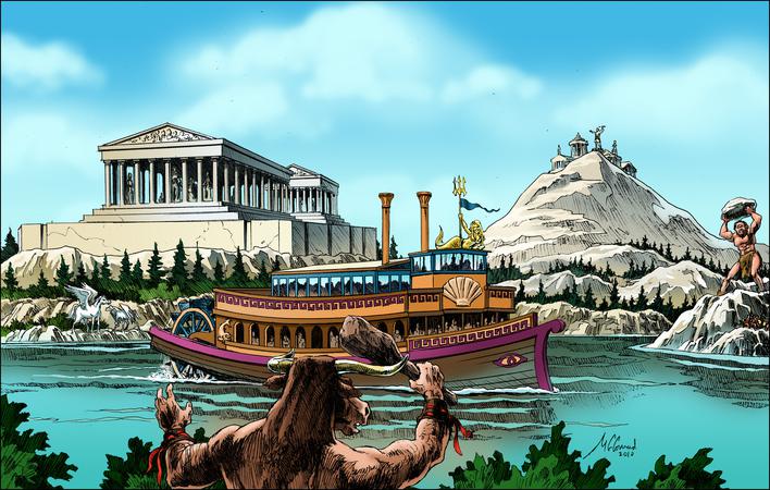
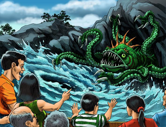
See Monsters. A modified paddleboat carries passengers on a thrilling odyssey through Poseidon's Labyrinth for an encounter with the dreaded Minotaur and the titanic Cyclops before braving the treacherous Scylla and Charibdys.
© Steelman Partners
Launch Engagement. Guests board the futuristic StratoChasers coaster to be catapulted across the sky, battling malevolent robot drones that threaten to topple the city's tallest buildings.
Rising to the Occasion. At the heart of SuperLand is Hero HQ, where guests take on the job of spotting trouble from their elevated platform and alerting the superheroes that their arch enemies are up to no good.
© Steelman Partners
In-Depth Analysis. Adventurous guests voyage deep beneath the waves in a steampunk submarine to explore the mysteries of the Bermuda Triangle, passing through a series of enigmatic scenes before reaching the lost city of Atlantis.
© Steelman Partners
Out on a Limb. Guests are towed aloft by playful birds to Flutter and Fly among gentrified treetops before heading out on an ill-advised jaunt through less familiar woods, where dangerous hawks keep a sharp eye out for unsuspecting prey.
© Steelman Partners
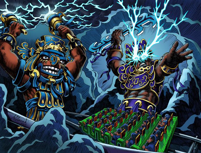
Dead Reckoning. The mythical realm of Xibalba, the Mayan Underworld, is a torturous chain of caverns where strange and frightening gods rule over the elements. The newly dead must face perilous tests while passing through the Houses of Knives, of Cold, of Fire, of Dark, of Jaguars and of Bats before earning a place in the afterlife.
© Steelman Partners
JUST FOR FUN
Oh Caption,
My Caption!
Editorial Cartoons
Poke Fun at the
High and the Low
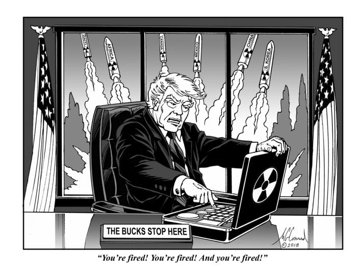
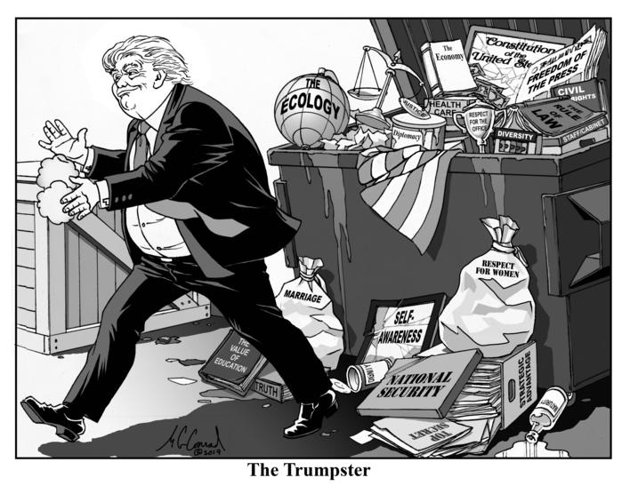
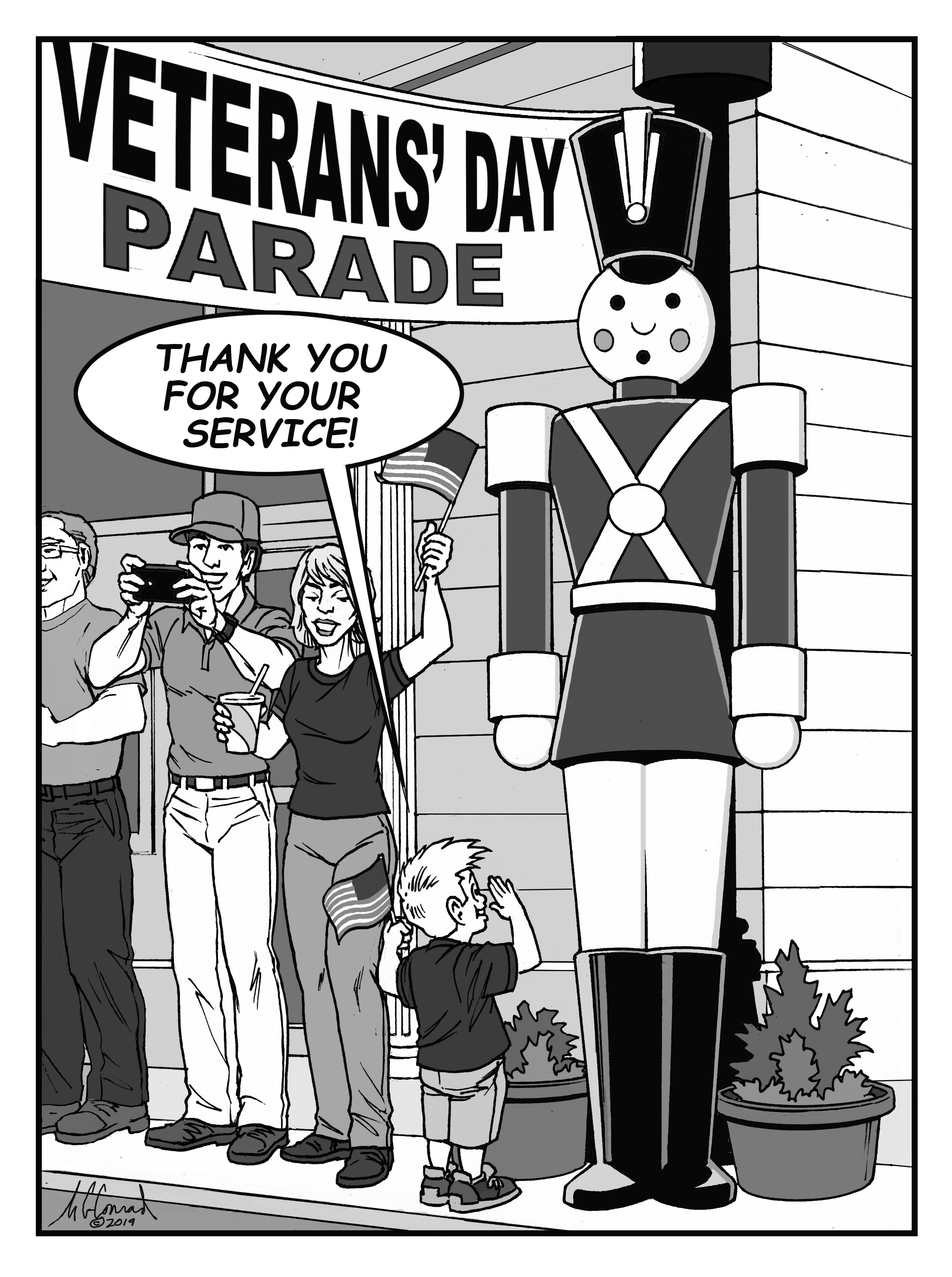
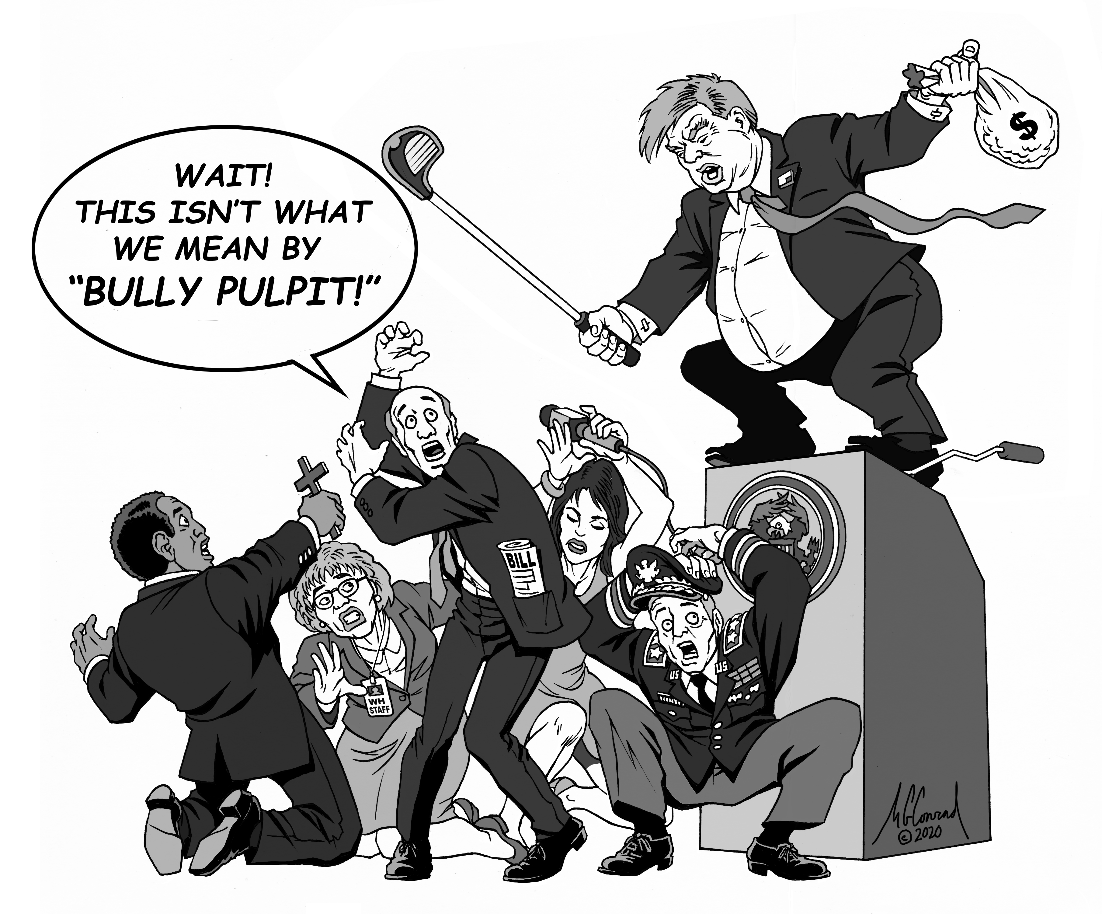
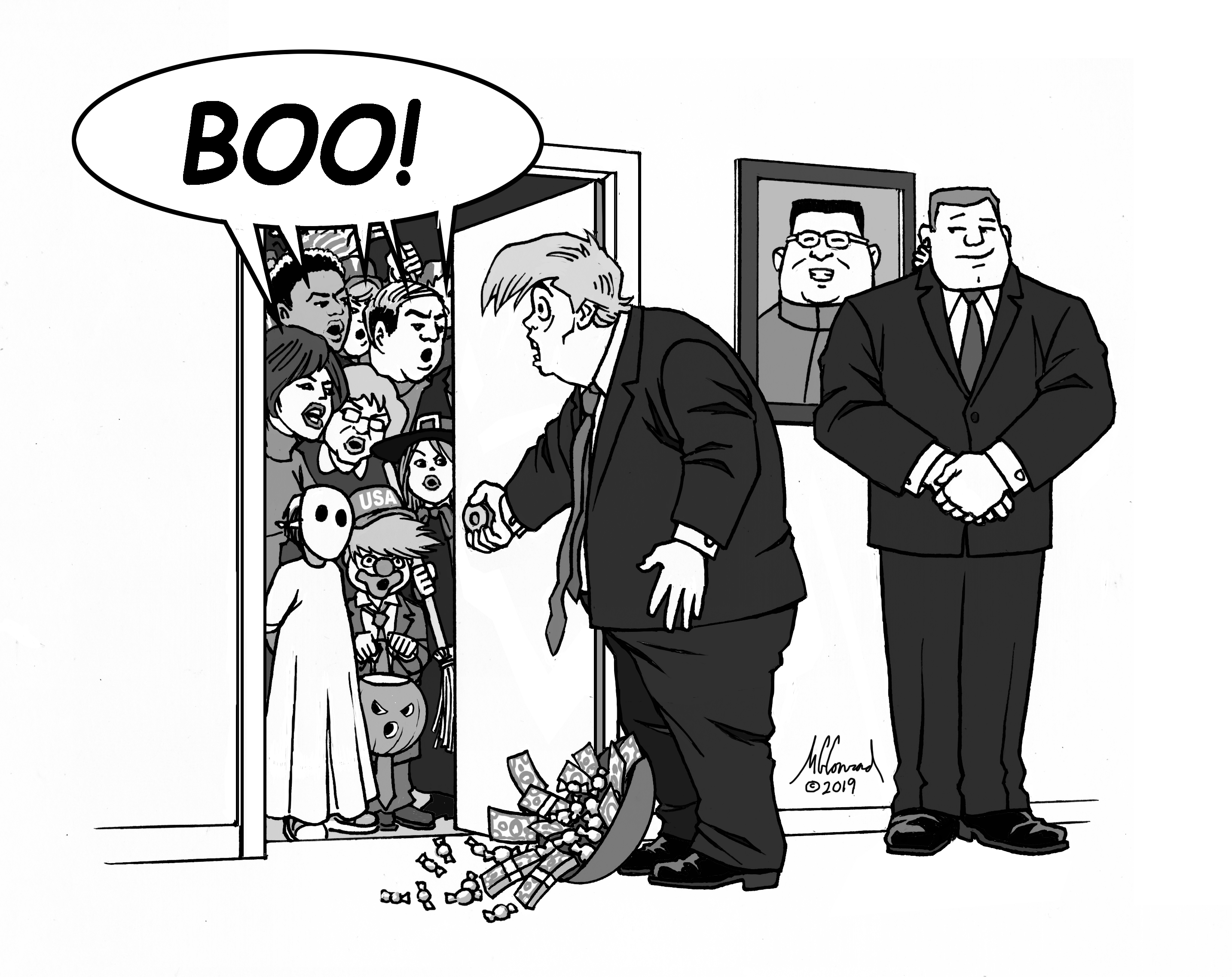
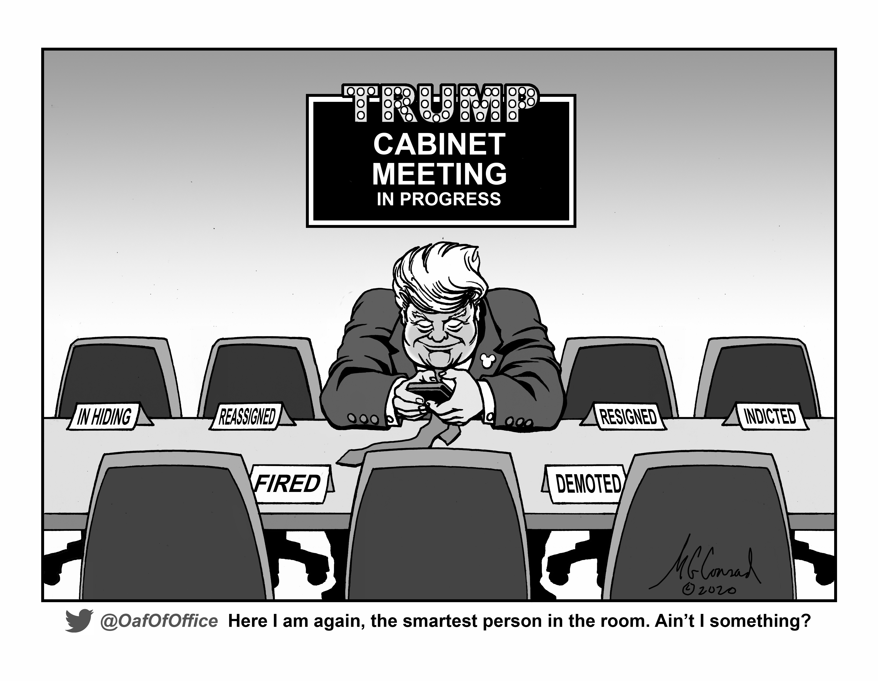
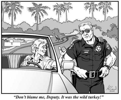
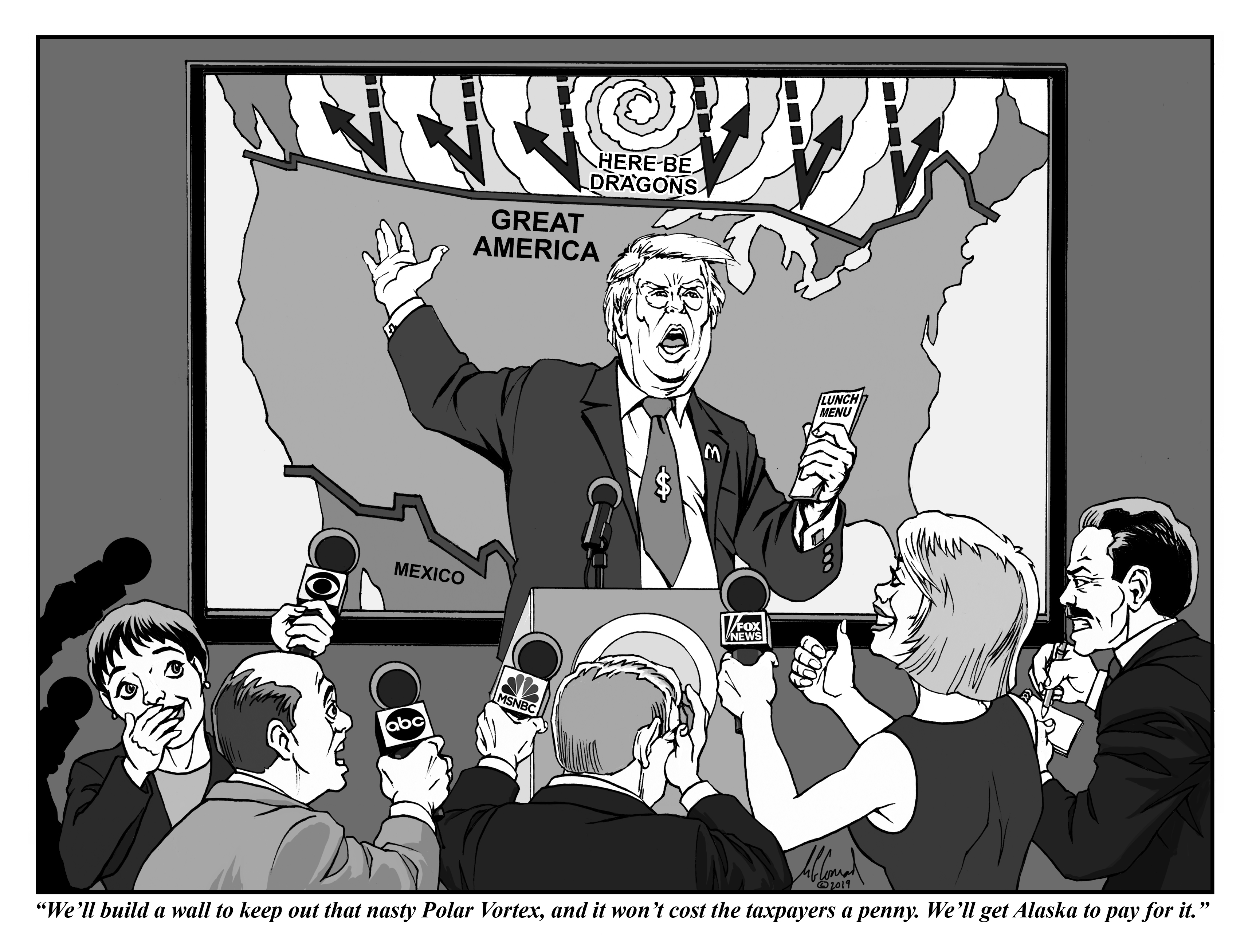
I have always admired good editorial cartoons and the artists who create them. Whether they are skewering a laughable political faction or pointing out the irony in some item in the news, the best ones are either poignant or funny, and the very best manage to be both.
Many a friend or colleague, looking at one of my drawings, has told me I ought to “send that in,” as if there were a central clearing house for one-off cartoons that would catapult me to fame and fortune.
Alas, that’s not how it works. In order to even be considered for publication in, say, The New Yorker, I would have to submit a hefty portfolio of cartoons, and then be ready to compete with who knows how many other hopefuls, many of whom are no doubt more eager to focus on this one particular form of expression full-time.
I have thought about it, though. The problem I keep running up against is that – at least in my case – it would be difficult to keep coming up with fresh ideas on a regular schedule without my work becoming formulaic or too predictable. Not to mention the worry that someone else may beat me to the punch.
I remember one Sunday years ago, when I was reading the funnies and came across the very same joke in no less than three syndicated strips! All I could figure was that the cartoonists had attended the same party that week and they’d all laughed at the same witty line.
But the current political climate has proven me wrong. Every day, there is another bit of political shenanigans to lampoon or inconsistency to bring into sharper relief. At least until the next national election, there doesn’t seem to be any lack of material to work with. So I approached the local paper, the West Volusia Beacon, and struck a deal – for no money, but i would get a free subscription and an ad for my company. Not everything I sent in made it into print, mind you, but that didn't stop me from putting them up on my Facebook page!
Although I have tried to work in a few panels that are not about President Trump, I’m not really enthusiastic about local politics. I am basically a moderate – a centrist, if you will – who finds fault with all extreme viewpoints. It just so happens that the most prominent proponent of extreme views is also the guy in position to act on them with the potential for the most terrible consequences. If a Democrat were in the Oval Office, doing his or her best to lower the standards of the presidency, I’d be making fun of that politician, too. On the other hand, maybe the inauguration will signal a return to competent statesmanship, and I’ll be out of material again.
Good thing I haven’t quit my day job!
MIKE'S BLOG
Verbal Fixation Part 3:
Hyperbole is the Worst!
“You can’t make this stuff up!” exclaims a self-identifying social media pundit, aghast at some outrageous news morsel. Really? I bet I can come up with something at least as absurd. Hold my beer while I toss out a few wacky headlines.
Jeopardy!-winning supercomputer Watson cast as TV’s next Bachelor.
Florida man arrested for attacking women in his dreams.
Dead fish brought back to life through voodoo “kill and release” practice.
See? It’s not that hard. After all, supermarket tabloids do it all the time. To claim it can’t be done is more of an admission of your own limited imagination – since you could not cook up such a story, you can’t imagine someone else being able to do it. But what’s really astonishing to you is the fact that something this absurd actually happened. If you want to express your own amazement, please don’t presume to tell us what we can and cannot do with regard to fiction. Take ownership of your incredulity and say something more like this: “I can hardly believe this happened!”
Unless otherwise indicated, all content © Mike Conrad or Radical Concepts, Inc.
ARCHIVE
Vol. 1 No. 1 (no longer available)
Military Caricatures (Humorous Posters)
Peter Parsec, Space Cadet (Satirical Comic Book)
More Bang for your Buck Rogers (Sci-fi Kluges Made from Trash)
Batman Forever (The Dark Knight Sees the Light in a Single Day)
Water You Lookin' At? (Mermaid Stunt Show Set in a Mystical Lagoon)
Fiberglass Menagerie (Creating Colorful Critters for Community Causes)
Tour the World (A Dark Ride that's on the Lighter Side)
Dinosaurs Make their Mark on the World (Cartoon)
Battlefield Promotion (A Naval Air Museum Throttles Up its PR Effort)
Second Stage Ignition (Kennedy Space Center Leaps into the New Millennium)
Flights of Fantasy (A Gallery of Fantasy/Sci Fi Illustration with a Flying Theme)
Reach for the Sky (Model Rockets Are Built to Fly)
Whole Lotto Quick Pics for the Holidays (Ad Agency Storyboards Visualize a Host of Christmas Presentations)
Jungle Bells (A Holiday Makeover for Disney's Animal Kingdom Parade)
Designs on the MillenniuM (Concepts for the Year 2000 Celebration at EPCOT)
Godzilla's Back! (In the game of Godzilla Gifting, the rule is "Go Big and Go Home"
To view previous issues of The RadCon Rapport, click on the links below:
Vol. 7 No. 2 September 2020
© Steelman Partners


